Monday, 29 September 2014
Definition Post Tone
Definition Post
Harmonise with (something) in terms of colour.
Describing Words - Colourful, Singular, Emotion, Warmth, Coldness
This photo uses tone for dramatic effect, the hole in the tree stump, no longer looks like a hole in a tree stump, it looks interesting and amazing. For all you know this is a massive hole in the ground, tone has created that look.
Here tone is creating a warm effect, you look at it and can just every so lightly guess the temperture and right now it feels warm. Tone has a way of not only getting in your sight but also in your other senses.
I find this picture to be quite cold, the blue water and blue sky, sends cold goosebumps across my body. It is amazing the effect of tone can have on a viewer, it can take an ordinary photo and turn into one with emotion and senses.
This image is your standard black and white tone, although it gives an ever so slightly cold effect, it can also be rather warm. The photo is really nice and attracts your other senses.
My Definition: Tone is a way of introducing different senses to a photo.
Image Bank Tone
The tone here is similar to the sepia filter, the image looks a bit gloomy and dull yet bright and powerful. The image makes the building stand out and look incredible, the patches of sunlight are highlighted due to the tone of the image.
The photo here is simply black and white, this creates an eerie atmosphere about this neighbourhood, the buildings have a creepy sensation about them the whole image uses tone to make the viewer feel odd and a little on edge.
The blue tone here highlights the strangeness about the man, he is clearly not used to light, behind is darkness and his face is rather creepy, tone here shows use how strange the man is and adds to the overall creepiness of the image.
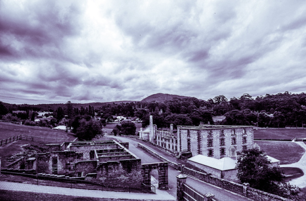
The purple tone over this image feels as if the world is moving faster, looking at the clouds at the clouds we can see that they are all moving towards the foreground and i believe the use of tone makes it seem as if they are moving currently very fast. The town below also looks incredible the use of tone here shows the paths and buildings in a unique way.
The pink tone in this picture feels as if it's light coming from the sky, the water looks absolutely beautiful and the ice has a very slight pink tint to it, the whole image looks quite magical and mysterious.
This photo uses black and white tone in order to show the elegance and strength in the rock, it appears to be very high up, above the trees and just below the clouds, this i the effect created by the tone.
Artist Log - Yuri Yasuda
Yuri Yasuda
Yuri Yasuda focuses on people in a really fun way and this is why i chose them, the creativity used to change people is amazing, playing with makeup and colours. Yasuda uses a lot of formal elements such as colour, form, movement. I like Yuri's work as I find them to be fun, the choice of people is really cool, using make-up to alter their appearance.

In this photo i really likes the way make-up was used. There is also use of colour, white in this photo camouflages the girl to the wall and brings out her hair and bow tie as well as the make-up. I really like this photo I think it's amazing to look at and is really quite cool.

In this photo there is a lot of colour used, pink, blue and black. the blue in the background makes the girl sit on top of the photo, there is also use of depth with the building in the background increasing the effect of colour on the girl making her even pop out of the photo.

The photo above is a weird one for Yuri Yasuda as usually there are people in their photos but no this time and that is way i chose it. There is use of form on the boots and in a weird way depth, using the boarder to make the boots feel further away. The flower adds the one sense of colour to the photo.

Above is a photo of Yuri's that uses movement, with the man in the foreground rushing around it adds depth to the men in the back ground. The use of one rectangle of colour is strange but works in this photo.
I would like to use Yuri Yasuda's eye for colour, picking out those specific bits of colour to introduce life into there work is extraordinary.
Yasuda has influenced my work as I like to think I began to think about colour and where it's placed rather than just having it involved. Although I would like to take some of the concepts such as the skull makeup and other portraits in that style.
I have began to grow less fond of Yasudas work, I still admire the way the makeup is incorporated into their work but I feel as if it's not what I want to do as much I thought in the beginning
Sunday, 28 September 2014
Artists Log - Amy Spanos
Amy Spanos
I chose Amy Spanos because I really like her work, it's creative, freaky and fun to look at, she uses a variety of formal elements to bring here photos to life such as colour, tone, lines, reflection, depth and basically anything she can find in the area. I really like her work because of how freaky it can be but then beautiful at the same time, the themes that she uses such as serial killers to abandoned hospitals and forests are what I find simply fascinating.
Gerrard Schaeffer
The image above is part of Spanos' serial killer week, this is based on the work of Gerrard Schaeffer who as you can guess hog tied his victims, but what is so great about this picture is the tone, it's dark and mysterious. The bloody body in the middle with a glimpse of light just floating by it. I think she has taken the likeness of Schaeffer and visualised his killings in a creative, scary and life like way. The use of form really makes the victim believable. The compassion of the model is great, especially when there is a light shinning right above her.
Halloween Part 4
Amy sets herself many projects and above is her 2013 Halloween project which consists or mysterious deaths. The use of the environment around the body is very clever the way everything leads to him, the lines on the ground, the doorway, he is clearly the centre of attention. The use of depth and colour really shows the creepy aspect which she is trying to get across.
The Sublime Stare Of Solitude
This was taken in an abandoned mental hospital, and if that isn't creepy enough the clothing and use of formal elements really makes this photo freaky. The use of depth through he windows gives you the feeling you're in the middle of no where, along with form in the chair and tone of the entire image really grabs you by the throat.
Trying My Best To Let You Go
This photo uses colour with the green around the edges and brown in the middle giving you something to focus on. The photo is like a fantasy land, the way in which the person is sitting is weird enough without the random bubbles but what this photo does is really cool in the way it increases the idea of forests being magical and mysterious.
I really like Amy Spanos' work and would love to interpret the weirdness and a variety of creepy and mysteriousness into my photos.
She has influenced my work as within our studio sessions I have often thought about Amy's studio work and how I can relate my work to her own, using the images of studio portraits by Amy Spanos I can try and incorporate that into my work, as I have been doing. I would like to incorporate her weird and wonderful imagination into work including the dark corners of it because that is what makes her work so incredible. I definitely feel that after researching this artist I have incorporated some of her themes in to my work, for example in a lot of her photos she creates fear but in an intriguing way, it just makes you want to know what happens after the photo is taken;
Even though the photo on the left is part of my Mapplethorpe collection I feel as if it has elements of Amy Spanos in it, I chose the photo on the right to compare, as you can see the composition is very similar, both have a lack of colour and a strange sensation of horror. You can see the similarities quite clearly and I like to think that Amy Spanos has inspired me greatly when creating something weird and a bit scary.
As a summery I really like Amy's work, I find it pleasing to look at, as well as creative and fun. She can take serious matter and make them funny or interesting, she tried to get you involved in as much of the background of her photos as possible. She is an incredible artist and deserves a lot more recognition, she is my all time favourite and one I will refer to time and time again, as I really want to add bits her her to my own work.
Research Log
Amy Spanos
http://amyspanos.blogspot.co.uk
Amy Spanos uses a lot of colour in her work, as you can see in the image above she uses particular reds, oranges, browns to create a warm sensation but also by use sing these the girl in the centre becomes an anomaly as she is made up of primarily white excluding the brown coat. This is a great example of her work in the way colour is used, she tends to create weird and abnormal photos and colour is a great way to do that.
http://www.anseladams.com
Adams use of depth and tone is widespread across his work. Adams photography focuses on nature and wildlife, with this he he uses a few of the formal elements such as depth, rhone and form making his pictures seem 3-D and alive.
http://www.timpage.com.au
Page is a war photographer a lot of his work is taken from the sky, in doing he captures the path ways, streams, roads or anything that could become a line from further away. I believe he captures lines in a very interesting way, as it is all natural but used in a different way.
http://samtaylorjohnson.com
Sam Taylor-Johnson takes weird photos that I feel are surrounded by the formal element of form, form is in all of her work and it is used in ways such as the image above, I believe this to be a good example of her work as it shows the weirdness or her work but then the formal elements, such as in the one above i can see form and maybe some colour as well as lines.
http://diane-arbus-photography.com
Diane Arbus also known as 'The Photographed of Freaks'. She takes photos of the physically abnormal and the mentally, usually portrait photos and she uses the formal elements of tone and form. As you can see above the use of form works well as he is almost popping out of the image, I believe this photo shows Arbus' work and what she is interested in.

The Wade brothers consist of David Lindsey Wade and Lydon wade, together they use colour, tone, reflection, form and basically any formal element they can get their hands on, they are incredibly creative taking original and fun photos.
http://www.dimitristheocharis.com/gallery/1/

Theocharis focuses on people and having them photographed in a what he believes sexy way, occasionally they'll do nudes but mainly he will use tone and colour to bring the people in the images to life.
http://www.luigibussolati.com/

Bussolati uses a lot of colour in his work, from pictures of nature to a motherboard turned sky line. His use of colour changes your perspective on the image and you see something different as the image above is almost city like surrounded by the blue sky and blue waters.
http://www.yuriyasuda.com/

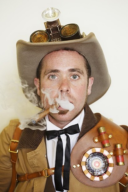
Yasuda uses form, tone, colour and movement in their photos in an attempt to grab your attention and it works, their work is very fun to look at. The use of people brings what would be a typical building or road into a great photo.
Knudsen is a clever photographer who uses colour and movement with a range of other formal elements to bring their images to life. Their work is weird and wonderful, leaving you to figure out the story behind it.

Prager is a weird artist whose work varies but always has a grip on the viewer, I find his work to be creative and fun, using formal elements such as phone he really paints a picture.

Erik is a very strange artist who photographs what he cans and in the editing process turns them into masterpieces, the one above it just a taster of the weirdness Erik offers, from waterfall roads to impossible paths your world really is changed by simply viewing his work.


Amy Spanos uses a lot of colour in her work, as you can see in the image above she uses particular reds, oranges, browns to create a warm sensation but also by use sing these the girl in the centre becomes an anomaly as she is made up of primarily white excluding the brown coat. This is a great example of her work in the way colour is used, she tends to create weird and abnormal photos and colour is a great way to do that.
Ansel Adams
http://www.anseladams.com
Adams use of depth and tone is widespread across his work. Adams photography focuses on nature and wildlife, with this he he uses a few of the formal elements such as depth, rhone and form making his pictures seem 3-D and alive.
Tim Page
http://www.timpage.com.au
Page is a war photographer a lot of his work is taken from the sky, in doing he captures the path ways, streams, roads or anything that could become a line from further away. I believe he captures lines in a very interesting way, as it is all natural but used in a different way.
Sam Taylor-Johnson
http://samtaylorjohnson.com
Sam Taylor-Johnson takes weird photos that I feel are surrounded by the formal element of form, form is in all of her work and it is used in ways such as the image above, I believe this to be a good example of her work as it shows the weirdness or her work but then the formal elements, such as in the one above i can see form and maybe some colour as well as lines.
Diane Arbus
http://diane-arbus-photography.com
Diane Arbus also known as 'The Photographed of Freaks'. She takes photos of the physically abnormal and the mentally, usually portrait photos and she uses the formal elements of tone and form. As you can see above the use of form works well as he is almost popping out of the image, I believe this photo shows Arbus' work and what she is interested in.
Nick Ut
Ut took a lot of the his photos during Vietnam, he took photos of the destruction and danger the war had and how it effected people's lives. Tone is used a lot in his work to bring emotion to his photographs he is trying to capture pain and let you know what these people have gone through.

The Wade brothers consist of David Lindsey Wade and Lydon wade, together they use colour, tone, reflection, form and basically any formal element they can get their hands on, they are incredibly creative taking original and fun photos.
Dimitris Theocharis
http://www.dimitristheocharis.com/gallery/1/

Theocharis focuses on people and having them photographed in a what he believes sexy way, occasionally they'll do nudes but mainly he will use tone and colour to bring the people in the images to life.
Luigi Bussolati
http://www.luigibussolati.com/

Bussolati uses a lot of colour in his work, from pictures of nature to a motherboard turned sky line. His use of colour changes your perspective on the image and you see something different as the image above is almost city like surrounded by the blue sky and blue waters.
Yuri Yasuda
http://www.yuriyasuda.com/

Yasuda uses form, tone, colour and movement in their photos in an attempt to grab your attention and it works, their work is very fun to look at. The use of people brings what would be a typical building or road into a great photo.
Henrik Knudsen
Knudsen is a clever photographer who uses colour and movement with a range of other formal elements to bring their images to life. Their work is weird and wonderful, leaving you to figure out the story behind it.
Nicholas Samaras
Samaras takes photos underwater, this brings a whole new world into our own. You're greeted by aliens on his front page as the underwater world takes over ours. It's truly amazing the photos Samaras has taken.
Alex Prager

Prager is a weird artist whose work varies but always has a grip on the viewer, I find his work to be creative and fun, using formal elements such as phone he really paints a picture.
Erik Johansson

Erik is a very strange artist who photographs what he cans and in the editing process turns them into masterpieces, the one above it just a taster of the weirdness Erik offers, from waterfall roads to impossible paths your world really is changed by simply viewing his work.
Paul Harries
Paul Harries is an amazing photographer who has worked with company's such as Kerrang magazine, he photographers bands especially in their crazy state, using colour to bring them to life along with tone and many others.
Scott Kelby

Scott Kelby, he focuses on people. Through sports, fashion, beauty and the military Kelby looks at people and how they look, he wants his photos to be just as beautiful as the people in them.
Margaret Bourke-White

White is a WWII photographer, some of her work detailing soldiers but mostly of the people of New York around the time of war. One of her most famous photos being Ghandi, White has taken some inspirational photos.
Paul Strand

Strand's work is very diverse, ranging from people to landscapes to buildings, whatever Strand wanted to he did. A lot of his work covers many subjects leaving an impront on the viewers mind.
Ellen Von Unwerth

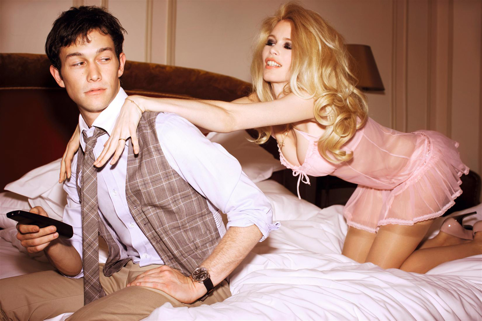
Unwerth is a model turned photographer, working with magazines such as Vouge and celebrities such as Joseph Jordan-Levitt, Emma Watson and Claudia Schiffer. Unwerth's work is usually pretty weird and very sexual.
Martin Parr

Parr ranges through topics, weekly even, he finds a topic he likes and takes as many photos as he can with that topic. his images range from 'goth weekend' and loads of different cultures.
Subscribe to:
Comments (Atom)


