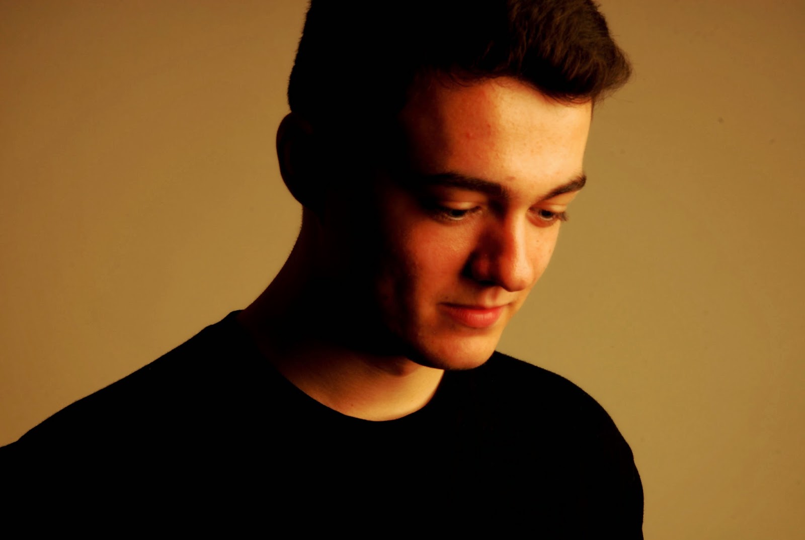
This photo clearly expresses photo joiner, it's made up of photos at completely different angles and distance, even some of the pictures making up the photo joiner are of different tones. This makes for a really cool image, it makes the photo more personal and memorable. I really like how the photo at the bottom starts off quite far away and her body appears smaller and then as the camera moves up her body it gets closer and distort around the head area. The photos in this photo joiner are range in size, some of them are small (mainly focused in the centre of the image), they become much larger on the outside of the image.
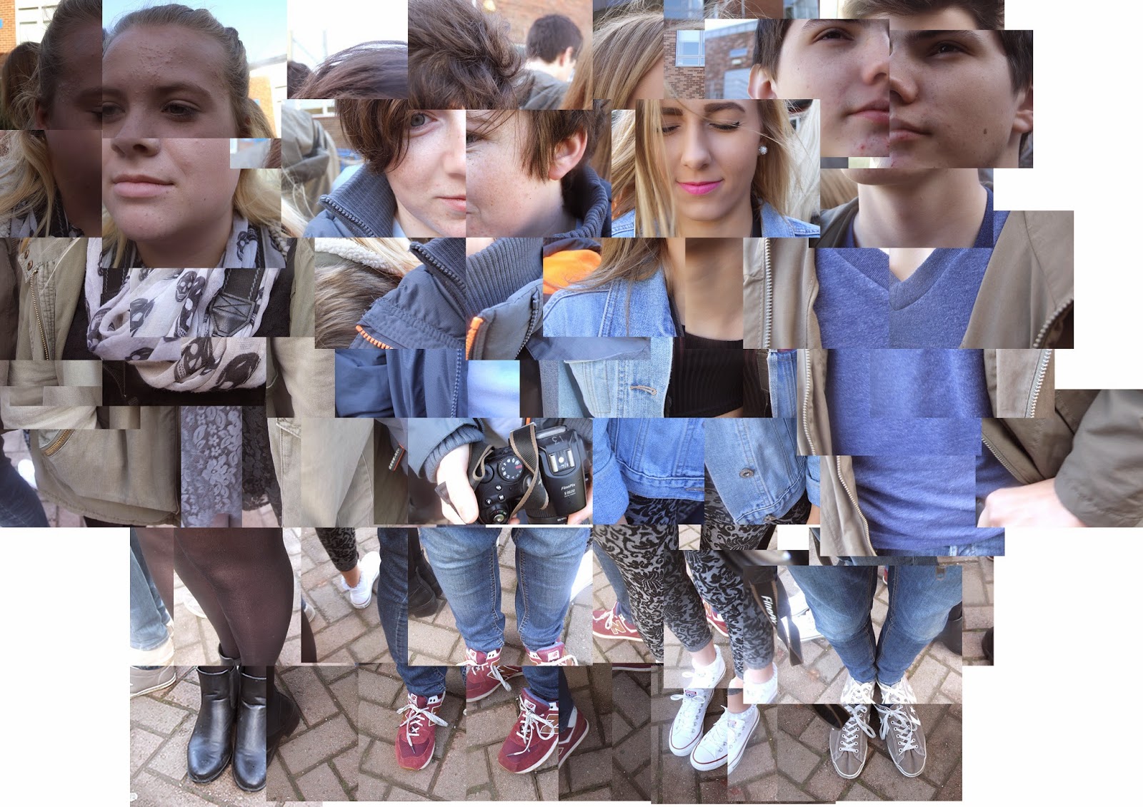
This is my image, my photo joiner consisted of 4 people standing in a circle (square depending on how you see it), I began at the feet and worked my way around and up. I really like the way I've started at the bottom as the feet seem small and further away and as I move up the their bodies, they get closer and then their face is distorted and messed up. This image could be a lot better though, as you can see in the top left hand corner and along the top of the image, it's all very boxed in, I have recently gone back over my photo joiner and fixed this issue as, I now have spread the images out a bit more covering more of the the background making it look less boxed in and more free. The photos in this photo joiner and all the same size, I think overall it now has less of an impact as a photo, it's very generic.
The two photos are similar in the way the people are portrayed, starting off small at the feet and working their way up the body becoming closer and more distort at the face, both photos are made up of images taken from different angles and distances. I believe the best way to create a photo joiner is to create a distorted photo combined of different images and I like to think that I've done that very well and I can relate that to the first photo. From looking at the photos I think it's clear to see that the first photo is a lot more well done then my photo, this is because mine has a boarder where some of the photos are in line with each other but the first photo doesn't have this, maybe that's because there's only one person but I could have increased the size of the image to fix this problem. The sizes of each image is different, in the sourced image, the photos vary in size from small to large whereas mine is consistent in the size of the photos used.