Thursday, 29 January 2015

Pattern Line Drawing


Whilst having some spare practical time, I decide to create a 'Line Drawing' I did a few of these at GCSE level Digital Art and felt like doing one now would be a creative way of portraying a photo. 


I'm rather proud of what I have created as it has taken a long time and a lot of effort but I think it looks cool and I would like to do another one of these in the future. 

Monday, 12 January 2015

Multiple Imagery Straight Images Redo


This time round I fixed my multiple imagery, the gaps between the photos are now even.


Thursday, 11 December 2014

End of Project Evaluation


Evaluation 


Now that the project has come to an end I'd like to say that I have learned a whole lot of new skills and ideas when it comes to taking a good photo, I tend to look out for the formal elements and if possible find a cool way to portray it. The formal elements were a great place to start as it built the basis of every photo I've taken, going through the course I have spent my time analysing other photos for formal elements and therefore being able to take photos with the formal elements in different ways. 

Through looking at different artist I have begun to develop my ideas and overall improve myself as a photographer. I have looked at 20 photographers overall and then I have picked 5 that I really like, the 5 that I chose are just ones that I enjoyed the look of their photos and really wanted to incorporate some of their unique ideas into my own work. All their work was different and unique in their own, for example Amy Spanos showed mystery and suspense using tone and 

Throughout the course, we have been picking the best photos we have taken, starting with contact sheets and the power points containing the very best, this allows me to analyse my own work and see what I've done to make these photos my best and where I could improve and take over to the next and now into the next unit. 

Mapplethorpe has become a great inspiration where portraiture is involved, he has enabled me to work on my composition and improve myself in this area of photography. I do like a lot of his work especially his portraits, he has influenced me to take more portraits and that is something I'd happily do again. 

Monday, 8 December 2014

Connecting Essay 5


This photo clearly expresses photo joiner, it's made up of photos at completely different angles and distance, even some of the pictures making up the photo joiner are of different tones. This makes for a really cool image, it makes the photo more personal and memorable. I really like how the photo at the bottom starts off quite far away and her body appears smaller and then as the camera moves up her body it gets closer and distort around the head area. The photos in this photo joiner are range in size, some of them are small (mainly focused in the centre of the image), they become much larger on the outside of the image.  
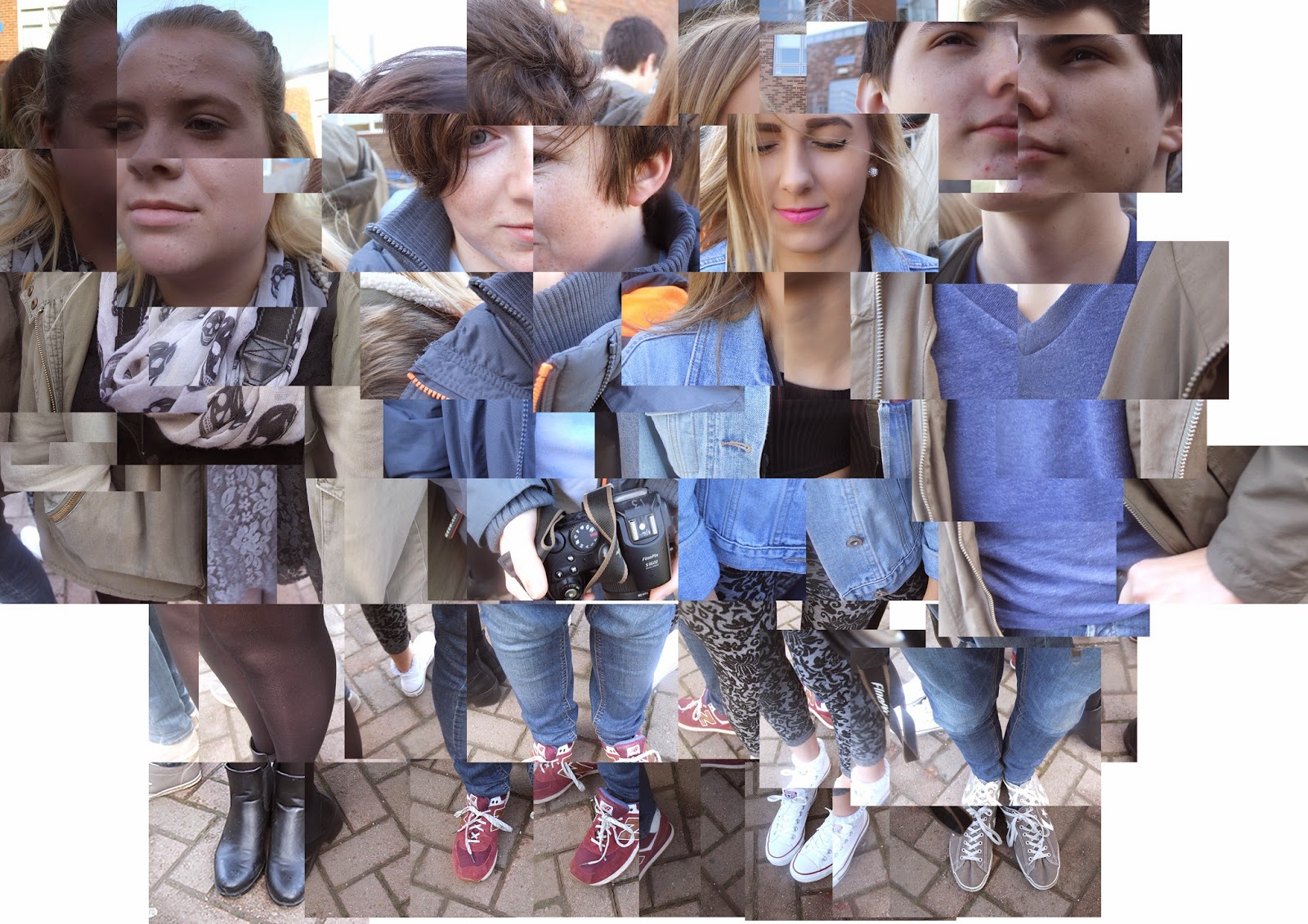

This is my image, my photo joiner consisted of 4 people standing in a circle (square depending on how you see it), I began at the feet and worked my way around and up. I really like the way I've started at the bottom as the feet seem small and further away and as I move up the their bodies, they get closer and then their face is distorted and messed up. This image could be a lot better though, as you can see in the top left hand corner and along the top of the image, it's all very boxed in, I have recently gone back over my photo joiner and fixed this issue as, I now have spread the images out a bit more covering more of the the background making it look less boxed in and more free. The photos in this photo joiner and all the same size, I think overall it now has less of an impact as a photo, it's very generic. 

The two photos are similar in the way the people are portrayed, starting off small at the feet and working their way up the body becoming closer and more distort at the face, both photos are made up of images taken from different angles and distances. I believe the best way to create a photo joiner is to create a distorted photo combined of different images and I like to think that I've done that very well and I can relate that to the first photo. From looking at the photos I think it's clear to see that the first photo is a lot more well done then my photo, this is because mine has a boarder where some of the photos are in line with each other but the first photo doesn't have this, maybe that's because there's only one person but I could have increased the size of the image to fix this problem. The sizes of each image is different, in the sourced image, the photos vary in size from small to large whereas mine is consistent in the size of the photos used.

Studio Contrast Work Diary 2


Work Diary


I believe that i had a much better session than last time, I managed to get a longer time taking photos and i came up with much more imaginative ideas and all round better photos. i found it a lot easier this this as I was able to tie more photos and take the skills from the 2 location and previous studio shots, although i occasionally struggled with ideas overall it was a much better session.

This photo uses contrast between the items of clothing, the fluffy jumper and the thin cardigan, there is clear contrast in the colour as well as the fabrics. I do really like the way  neither person takes up more room then the other in this photo both are either side of each other. 


There is a lot of contrast in this photo, from height, size, clothing and colour. I do really like this photo but I do think there are some improvements that could be done for example the model on the far right is a little to far away from the model in the middle and the model on the far left is a little to close, I feel that I need to pay a little more attention when taking photos to fix problems like this straight away. 

To improve, I'd properly change the lighting each picture feels really dark and difficult to see what's going on. 

Studio Contrast Work Diary


Work Diary


I didn't have a whole lot of time during this session as we were the last group in, I token a reasonable amount of photos but nothing I was massively proud of, but none the less I still had some good photos. I found this session to be rather easy as I had already tried contrast location and I incorporated what I'd learnt for from that and brought in into the studio.


In this photo the contrast between the two models is quite clear, one has a bowl around her head the other does not, I thought this photo was fun to look at, it looks good and makes you laugh a little, although for this photo I would have to crop of the right hand side as the background has come in a little.


This photo has a lot of contrast involved for example an obvious one it the different kind of shoe but also leg size, jeans, shoe size and colour, this image is good but for me the shoes could be more centred but also more in line with each other as one is higher than the other. 

To improve, I'd like a longer period and i believe that i could come up with some more creative ideas and much better photos.

Connecting Essay 4


This multiple imagery captures colours of free, white, yellow and brown. The photos have been taken very close to the flowers and grass, showing texture among the leaves, this photo does a very good job of including formal elements within the multiple imagery. I do really like the photo above and believe it contributes massively to what it is trying to show, as well as being multiple imagery it also has aspects of photo joiner. The distance between each image is also very tight. 


My image shows a lot of colours, that are very similar to each there and I think that works really well, the photo is very Autumn with clouds such as brown, yellow, green and white. This is my favourite multiple imagery because of well the pictures slot together, I have chosen to have rather large gaps between the images yet you can still tell that they fit very nicely next to each other. 

The two images are very nicely similar to each other, they both portray Autumn colours and I can many similarities in the way the images are taken, both are rather close up and resemble similar themes with nature and colour. The photos in my picture are further apart and not every distance is equal to each other (I later fixed this), whereas the first photo each picture is rather lose to the other and each distance is near enough the same size. Although the pictures have similar themes and can be easily related there are many differences, another being the tone of the pictures, the first photo is quite yellow whereas mine is just the original colours, I haven't added any tone but it seems that the internet photo may have done. 


Connecting Essay 3


This is a portrait that has been edited to created an almost layer black and white, as if they just put bits of paper onto each other. I really like the concept and the way the image as turned out. Her face really stands out as there is less detail everywhere else you realise the more significant details on her face and she becomes less personal as this kind of editing can make anyone look basic, it takes away the finer details. 


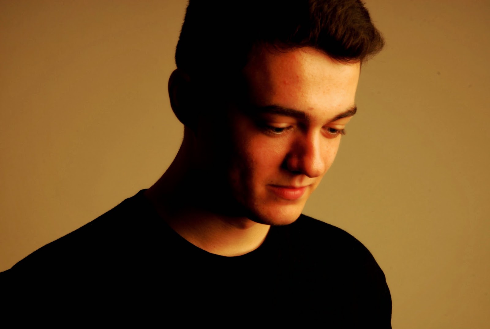
This is my image, I've taken a similar approach to the image but above, again I've edited it to try and remove the finer details within the face and neck, the body is black swell as the hair so the focus on the face, his face even blends in with the background making him less of a person and just the main features of a face. 

The two photos are closely related in what they do to the model but mine seems to be less edited than the other one. I like to think mine feels more real yet distance and cold, the other image feels too edited and almost dirty, with how some of the layers sit. I do like both photos but I feel as if I have done a better job AT capturing a distant and cold look. The first photo feels a bit weird, It doesn't look that good, through editing the picture the artist has ruined it in a way, whereas mine needs some work but overall isn't actually that bad. 

Contrast Location Work Diary 2


Work Diary


In this session I had the opportunity to take photos of people surrounding the idea of contrast, I found this easy as you use pretty much anything for example contrast in gender and height. This was easy for me as I had already practiced these skills trying to do studio work.


This photo uses contrast really well, the colour difference in the jumper and jacket flows really nicely, not only is there contrast in colour but also in the fabric as you can clearly see the difference in the soft jumper and rough jacket. . 


This photo shows contrast in something other than colour, in this photo the contrast is between the sky and buildings, the sky is cloudy but also flat almost whereas the building is more alive and the different look of the building next to the sky is really nice. 

To improve I believe that i could find better contrast between people, gender and height are very clear things perhaps it would be fun to take photos of minuscule contrast.

Contrast Location Work Diary


Work Diary


In this session we went out and focused on contrast much like in our studio work but this time within the real world and this meant being able to focus on nature and natural contrast. Flowers and walls had quiet a major part in session and that is what the majority of my photos resembled. I found this to be rather easy as i found good contrast in a natural environment although i did forget to take photos of contrast in people.


This is very good photo from the session, I like this photo because the contrast is strong yet there isn't a lot of the yellow, the compassion of the photo is what causes the contrast to have a better effect, I feel that if the yellow was in a corner the photo wouldn't be as good as it is. 


This for me is a really good photo, the contrast from the brick withe wall and the floor goes very well although there are things that I would improve, for example if I was to move the brick away from the door as there is no reason for it to be there, also I feel as if I need to take it from a better angle it looks a little sideways.